
Why is it important to make sure that your website is accessible? People often don’t consider accessibility when they are developing.
Firstly, what is accessibility and why is it important?
Accessibility is usually associated with disability, but it also the practice of making sure that your software can be used by as many different people as possible, including the users of a variety of devices or people with weak network connections.
It would not be right to give some users a poor experience with your software because they have a visual impairment. Remember, this reflects badly on you and your brand! If someone suffers a bad experience during their first engagement with your business they will remember it and be less likely to give you their custom.
Accessibility is required by law in some countries and benefits everyone.
- Semantic HTML is a part of accessibility and also benefits SEO, which means your business is more findable!
- An accessible website demonstrates you have good morals, which is great for your public image.
So now you might be asking, how do we make our site accessible?
Well, in order to be accessible we have to adhere to WCAG 2.0, which stands for Web Content Accessibility Guidelines 2.0.
WCAG 2.0 has 3 levels of conformance:
- Level A — the most basic web accessibility features
- Level AA — deals with the biggest and most common barriers for users with disabilities (which is what most developers and businesses adhere to)
- Level AAA — the highest (and most complex) level of web accessibility
Now, here are 5 top tips from Averment that will make your website more accessible.
- All images need to contain some alternative text
Why do we need alt text, you may ask?
Well, if your website is full of images, someone with a visual impairment will be unable to gather the context of your site. We, therefore, add a description to each image so that it can be understood when a screen reader or similar software reads it out to a user. This can be done like so:
<img src="/path/to/image.jpg" alt="This is a description that describes the image for anyone with a visual impairment" />
2. Headings should be ranked by their level
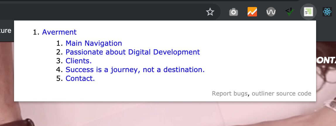
Headings communicate the organisation of a page of content, and are used by assistive technologies to provide in-page navigation. This can be checked in Google Chrome by using an HTML5 Outliner browser extension.
Headings should be nested by their rank (or level). The “most important” heading is (h1), and the “least important” heading is (h6). Headings with an equal or higher rank start a new section, while headings with a lower rank start new subsections that are part of the higher-ranked section.
Skipping heading ranks can be confusing and should be avoided wherever possible: Make sure that a (h2) is not followed directly by an (h4), for example. It is OK to skip ranks when closing subsections, for instance, a (h2) that begins a new section can follow an (h4) as it closes the previous section.
<h1>Page Title</h1>

<h2>Section one</h2>

<h3>Section one sub-heading</h3>

<p>Vestibulum id ligula porta felis euismod semper.</p>

<h3>Section one sub-heading two</h3>

<p>Vestibulum id ligula porta felis euismod semper.</p>

<h2>Section two</h2>
3. Colour contrasts
It’s extremely important to ensure that any text elements stand out against the background on a page. Personally, I struggle with a colour deficiency, so I see colours differently to most other people. I, therefore, find it hard to differentiate between variations of green and brown, so the example case of brown text against a green background would be difficult for me to read. You need to meet a certain level of contrast, depending on which level of WCAG you are conforming to. (We’ll go into this later.) This contrast ratio can be checked by using the WAVE browser extension that is available in Google Chrome’s extension store.

As you will see in the above screenshot, the two colours #FFFFFF and #D44C4A do not conform to the correct standards of colour contrast in most cases, except for AA in a large font size. Here is the breakdown of how these standards are defined:
- AA Large — This is the smallest acceptable amount of contrast for type sizes of 18pt and larger. This is a score of at least 3.0.
- AA — This is the sweet spot for text sizes that are below ~18pt. This is a score of at least 4.5.
- AAA — This is enhanced contrast with a score of at least 7.0. Think longer-form articles that will be read for a significant period of time.
4. Skip Links
Skip links are HTML links that are generally used by screen readers to navigate through the current page rather than link to a different page. Users with impairments will use them to “skip” over repetitive content that might not be useful to them.
Skip links are not usually visible on a web page to sighted users, but they can be “tabbed to” (using the tab key) by someone who may use a screen reader. In the example above, a screen reader would use the link to skip the video introduction and link to the main content further down the page. Another example of skip link use is allowing a visually impaired user to skip to the navigation section in order to navigate to a different page.
5. Using descriptive link titles
Would the links to social media in the example below be useful for someone with an impairment? The answer is no, let me explain why.
A screen reader wouldn’t be able to effectively describe these links to a user. So how do we tackle this? We have some “hidden” text that can be used to describe where these links go. Below you will see that we incorporated a span that tells the user, “Click here to go to Averment on Facebook”. Then we use some CSS to hide this text for a sighted user, but not from a screen reader. (It’s important to remember that we don’t use display: none; to hide this text because a screen reader cannot read this).
<a href="https://fb.me/AvermentDigital" target="_blank" rel="noopener noreferrer">
  <span className="visually-hidden">Click to go to Averment on Facebook</span>
  <Icon name="facebook" fill={"#ffffff"} width="20" height="20"/>
</a>
Here is the CSS making the magic happen.
.visually-hidden {
  position: absolute !important;
  height: 1px; width: 1px;
  overflow: hidden;
  clip: rect(1px 1px 1px 1px); /* IE6, IE7 */
  clip: rect(1px, 1px, 1px, 1px);
}
Essentially, all this does is place the text outside of the browser window where a sighted user cannot read it.
Thank you for reading our tips on accessibility, we hope that you found them useful and start to incorporate them if you haven’t done so already. (You really should be!)
Any questions?